Corne Akkers

Corne Akkers

1969, born in Nijmegen. My work can be seen in many countries all over the world. I employ a variety of styles that all have one thing in common: the ever search for the light on phenomena and all the shadows and light planes they block in. My favorites in doing so are oil paint, dry pastel and graphite pencil. It is not the form or the theme that counts but the way planes of certain tonal quality vary and block in the lights. Colours are relatively unimportant and can take on whatever scheme. It is the tonal quality that is ever present in my work, creating the illusion of depth and mass on a flat 2d-plane. I combine figurative work with the search for abstraction because neither in extremo can provide the desired art statement the public expects from an artist. Besides all that, exaggeration and deviation is the standard and results in a typical use of a strong colour scheme and a hugh tonal bandwith, in order to create art that, when the canvas or paper would be torn into pieces, in essence still would be recognizable.

About > Activities

Heater Troubles

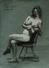
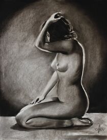
This pastel drawing ‘Model Session – 20-04-24 – 1’ is the first I made during this month’s session. Last time we had a man posing for us. This time there was a young woman ‘Bo’. A very fine person to work with. However there were some mishaps. We couldn’t find the heater in the studio. It’s situated in a community center, called ‘De Blauwe Tram’ in Leidschendam, Netherlands. Have someone model without a heater is a serious thing though. In fact, April in Holland is very could. So we cranked up the central heating and have her stand beside it against the wall. Consequently all participants had to stand in front of her in less than a 180 degrees angle. That means a farther distance than you like to have. In front you have a very puny figure even though she was a real fine model to look at.

Sitting Position

Strange how one small detail can mess up your session completely or did it? We started with a standing position but after 5 minutes she said she almost fainted. Seemed the heating was doing its job a bit to vigourously. We were sweating like pigs as well. Better have her sit down and that was the solution. A better position and way more attractive from an artistic point of view. In order to make up for lost time I worked a bit quicker than most sessions. I think I captured her essential features alright. These contingenties makes sessions like these all the more fun. You never can predict what sketch may come because of unpredictable parameters. Moreover she sat perfectly still. Wonderful job Bo. Thanks and I hope we see you back some day.

Pastel drawing on Hahnemühle Dürer Ingres-Bütten Night Blue paper (48 x 62,5 x 0.1 cm)
Artist: Corné Akkers

Solarised Look

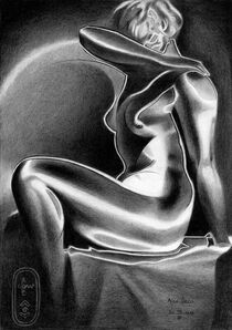
This graphite pencil drawing ‘Neo Deco – 09-04-24’ is the first one after a couple of pastel drawings. Seized by my currect oil painting in progress I kept the posting pace going by some live model sketches. Meanwhile I had this piece under way and I didn’t have a clue what to do with it. So each time at Brugman’s where I teach I worked at it, bit by bit. Originally I had something surrealistic in mind. Soon I changed the set-up and decided to opt for yet another solarised look. Actually, my last one ‘Sands Time – 23-03-24’ looks a bit like this one. The thing is that I didn’t want to loose the brilliant shadowy patterns on the model’s body. Some motifs and especially the lighting are great enough to only celebtrate these by a bit artistic enforcement.

Willy Zielke

The drawing is inspired by a 1930s photo made by Willy Zielke. Lately I have been browsing again online looking for pictures from the art deco era. A couple of pictures one night stood out because of the clean cut lighting he used. Certainly my cup of tea so to speak. My addition to the scene is the aforemention solarization and thick linear contour delineations. My aim was to create contrasts between soft tonal transitions and abrupt ones. I also let the body vaporize into the negative space. You can see that in the left arm, above her right breast and in her leg. This way all contrasts are present. There is light versus dark, soft versus harsh transitions and angular versus roundish. Personally, I like the hair locks the best. They look funny and strange in solarized forms.

Graphite pencil (Faber Castell Pitt Graphite Matt pencil 14B) drawing on Talens Bristol paper (21 x 29.7 x 0.1 cm)
Artist: Corné Akkers

Straight Up

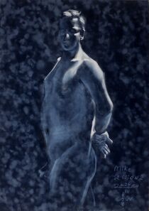
This pastel drawing ‘Model Session – 26-03-24 – 2’ is the second one of a succesful live model drawing session. Location: ‘De Blauwe Tram’ in Leidschendam. As explained in the art statement to the first pastel it’s a great place to have sessions at. Whereas that one showed a reclined position this one I really was looking forward to. So we moved the tables and had model Mike Wolters stand straight up. More or less a quite an academical pose but I had just the right paper in mind for that. Diving deep into my paper stash I was looking for some more Ingres paper. Suddenly I came across some marbled blue velours paper. I remember I bought it years ago at Goedman’s in The Hague. Back then my eye was caught by the beautiful marbled structure. Time to put it to good use.

Chiaroscuro Boudoir

There was a time I used velours paper more frequently. Probably using it for ‘Nude – 21-12-16 (sold)’ was the last time. Very unforgiven it is, especially for the untrained pastellists among us. There is little room for error because you can’t correct or erase lines properly. Thus a matter of carefully calculation proportions. The fun but also challenging part was to be only concerned renderdering the highlights. So no contour delineations, even not temporary ones. Besides this technical difficulty laying down strokes with Conté carrés always proofs to be difficult. On velours these carrés are bit too hard. The little hairs simply eject the tiny chalck particles into the air, creating funny vapes. Softer pastels are better but then you have to be sure that these strokes are there to stay. The overall result I like. It’s dramatically chiaroscuro boudoir-like.

Pastel drawing on velours paper (50 x 70 x 0.1 cm)
Artist: Corné Akkers

Shine a Light

This pastel drawing ‘Model Session – 26-03-24 – 1’ was the first I made during this month’s session. We were back at ‘De Blauwe Tram’ in Leidschendam, the perfect spot to have these sessions. It’s well equipped with lots of easles, privacy, no snoopers around and heating for the model. Last but not least, don’t underestimate lighting. You see, in such a gathering of multiple persons it’s almost impossible to set up lamps. They always blind somebody in a circle of artists around the model. That’s different from the freedom in a one-on-one session with a model back home but more expensive though. So we make do with what we got. There was enough light but not too much coming from the ceiling. It shined straight down, creating beautiful razor lights and shadows. Personally, I like those the best!

Blue on the Menu

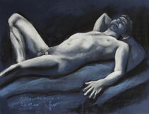
Perhaps a bit of a disappointment but I ran out of Clairefontaine’s blue Ingres paper. In a previous art statement to January 23rd’s session I mentioned it. Back home I dived into my paper stash and I found two other suitable blue sheets. One Canson Mi-teintes and one velours. The first go is rendered on Canson using only Conté chalks (black and white). Reclined positions are often a challenge because of the complexity of diagonally placed limbs and torsos. In order to get the right page filling I decided to skip the lower left leg. Instead, I concentrated on model Mike’s torso and streched out hand. First, size him up, get proportions right and fill up the paper with white pastel. Some Derwent XL charcoal extra dark touches. Next, a bit of erasing to render subtle visible structures in the musculature. That’s it. Not bad for tonight’s first attempt.

Pastel drawing on Canson Mi-Teintes paper (50 x 65 x 0.1 cm)
Artist: Corné Akkers

Jacob Again

This charcoal and pastel drawing ‘Prestudy to Sitting Nude by Jacob Merkelbach – 24-03-24’ is made under two hours. On a whim really because this afternoon I went to Brugman Art to teach model sketching. 7 enthusiasts but not experienced persons I wanted to give an example what to expect. As to drawing I also want to show students how I personally render the human figure. So I went early in order to get ready for the session and to set up a sketch. Of late I have disccovered the works of Jacob Merkelbach I have mentioned before. In fact, my last drawing was based on one of is beautiful photos. The pose of the woman shown in the picture was gorgeous and the posture simple at the same time. Doable under an hour I had before the group arrived.

Under Two Hours

Actually, I was finished doing the pose and the right proportions under half an hour. So I had the opportunity to show what I’m all about: tonality. I had only charcoal available. Thus the setup remained a bit pale. However, back home I decided to spend another half an hour to darken things up with Conté carré noir. Somehow I thought this might as well serve as a prestudy for a graphite pencil drawing. As such that always is meant as study for an oil painting. Obviously a prelude to a prelude more or less. It’s jolly good fun to do and show these sketches. See what the contrast in quality is between stuff I worked on for hours and those drawn quickly. Which works do you prefer?

Popular on Social Media

Strangely this classical or should I call it academical work is popular on social media. Take ‘Model Session – 23-01-24’ for example. According to Facebook this pastel became the most popular watched reel of late. Duly noted but I’m a bit ashamed because of the unpretentiousness of these drawings. There is nothing to convey, only beauty and tonal skills. What do you think, need I worry or carry on? A guilty pleasure, most definitively!

Pastel drawing on paper (49.8 x 64.6 x 0.1 cm)
Artist: Corné Akkers

Endlessness

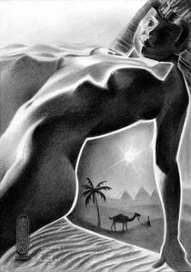
This graphite pencil drawing ‘Sands of Time – 23-03-24’ follows exactly one month after my last one ‘Cleopatra – 23-02-24’. They both are part of my series ‘Out of Egypt’ laid to rest for a couple of years. Lately I had some ideas or rather a kind of vision entering my mind. Perhaps more a spiritual journey after many meditations on the subject ‘infinity’. Isn’t that the artist’s job, to show exactly that? By now you ought to know my fulminations with regard the state art is in today. With little to convey many expressions of art seem only meant to decorate lush living rooms these days. I always associate Egypt and its art as way to transfer feelings of endlessness and the spiritual. I’ve never been in a desert before. However, sand dunes as far as the eye can see seem both freightening as well as enchanting.

Jacob Merkelbach

Well now, there’s the final result which is the spiritual as stated above. The initial cause is yet another great reference picture taken by Jacob Merkelbach. That’s why we call it the artistic motif. A motif is the instigant causing an artist to yearn for something else. That’s the start of soul searching deep inside to see what ideas are spawn from it. In my case it’s all about the tonality. I often discuss the realm of contrasts with students. The are part of ‘the implicate order’ ruling over phenomena and stuff people give meaning to. However, contrast is what makes things come alive. Water versus drought, light versus darkness. Hence my weapon of choice: black and white als element born by eternity to be portrayed by them. Can you dig it? Into the sand, that is.

Graphite pencil (Faber Castell Pitt Graphite Matt pencil 14B) drawing on Talens Bristol paper (21 x 29.7 x 0.1 cm)
Artist: Corné Akkers

Another Tribute

This graphite pencil drawing ‘Tribute to Alma Tadema – 16-03-24’ is dedicated to a painter causing a stir in England. That’s more than hundred years ago though. Not the first time I did that. Back in 2021 I did one including my regular model reclining under the mediterranean sun. Last year I did Psyche & Amor – 23-05-23 being an elaboration of that drawing. Isn’t that enough, you’d say? No, certainly not and below I will explain why.

Something Rotten

Something is rotten in the state art today or is it? Well, perhaps that’s too baldly put. In my statement to ‘The Infinite Waves of Eternity – 06-02-24’ I already spoke of a rubble pile of nonsense in this post-modern art world. Craft has left art and everythings goes, so it seems. Take tonal scales for example. Back in the day artists trained themselves in producing such a scale the first year in art school. With this drawing I want to demontrate what suitable tones can do and support the theme of an artwork. What do you think? A bit old-fashioned? Do you like Zene art, wall art or any other decorative work in general? Please let me know my sending me a mail.

Not the Ultimate Kitsch

Therefor I dedicate this drawing to someone who was accused of creating the ultimate kitsch. Cookie jar or cigar box art they call it. Kitsch or not, I’ll keep on referring to the beauty great artists sought to create throughout thousans of years. Lourens had a bit of a sweet tooth, that’s for sure. Surely great and original art though. By the way, the piece is inspired by a smashing reference picture by Jacob Merkelbach, called ‘La Petite Mélancholie’. So, this is also in honor of him. Some final words: the less skilled artist become, the more skills I will display.

Graphite pencil (Faber Castell Pitt Graphite Matt pencil 14B) drawing on Talens Bristol paper (21 x 29.7 x 0.1 cm)
Artist: Corné Akkers

Interesting Synthesis

This graphite pencil drawing ‘Neo Deco – 08-03-24’ is another homage to the realm of art deco. To be precise, I dedicate this one to photographer Walter Bird whose series ‘Beauty’s Daughthers’ is just breathtaking. Yet again because I already was inspired by some of his works as motifs for my drawings. In fact, last year. Thus, the Neo Deco series becomes an interesting synthesis of elements of art deco, cubism, roundism and surrealism. However, to some motifs I add more added value than others. Last one of Cleopatra came more from my mind than this one. Sometimes you’ll simply have to let it shine in its original splendor. Serving as a service-hatch from the Deco epoque to modern times, I take comfort in that.

Adaptations

It needed a bit of cubist styling and some abstraction. Especially in the highlights sections I skipped visible pores exposed by the oiled skin. Last but not least I deviated from the picture in the end. The head and neck looked a bit elongated compared to her chest. That could have been caused by the model leaning over towards the camera and warpness created by the camera lens. In addition, people were a shorter back in the day so the head-body ratio was a bit different. The more reason I made the head a bit smaller. The region between shoulder and jaw I also made a bit darker. Unfortunately an interesting swirl I created in the beck became an impediment. Such is life for an artist now and then.

Cunning Plan

As to lighting this Neo Deco variety looks a bit like ‘Cubist Study after Lauren Albin Guillot – 18-10-23’. Yet another great photographer from the same era. These chiaroscuro lightings are my favorite. They inspire me to take pictures of my models like that. There’s a cunning plan in my mind lingering about though. My secret wish is to sell a lot of prints and printables of this one and buy myself a big studio with lots of equipment. Then I can tweak lamps and light better in more space than I now have in my small apartment. Would you help me executing my plan?

Graphite pencil (Faber Castell Pitt Graphite Matt pencil 14B) drawing on Talens Bristol paper (21 x 29.7 x 0.1 cm)
Artist: Corné Akkers

Back in 2014

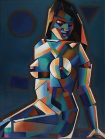
This oil painting ‘Neo Deco – 05-03-24’ is an elaboration of my pastel drawing ‘Cubist Nude – 28-03-14’. One I was bound to elaborate at some point. I remember I made that one on a whim at Brugman, Voorburg where I teach. Probably a quick sketch before art class. Sometimes those are the best, feeling free to experiment. Now, 10 years later it was about time to set it loose on linen. Little did I know working on a larger scale offers many new challenges.

Scaling Up, Troubles Bound

You see, scaling up this artistic motif didn’t satisfied me and it wasn’t that much bigger. Canson pastel paper is 50 x 65 cm and this painting measures 60 x 80 cm. However, after transferring basic proportions I thought the result was looking rather meager. Or was the result looking rather similar to the pastel drawing I already made in 2014? I don’t know really. Such things just happen when you use a motif a second time around. All bets are off. The trick is to find something new, in spite of the attraction of the initial drawing. There was some added value to be found.

Enter Color

Terrific to see how color also influences form. This female form demanded more forms this time but these weren’t supported by the monochromy I had in mind. Initially I had planned to execute it in blue only but it didn’t work for me really. Enter color and that always means a whole new ballgame. Blue needs orange. These two are complementary vibrant but also a bit boring, so green and pink were added. After a while I realized I had to change, even add forms as well. That was necessary balance all the different colored patches. Hence another jigsaw puzzle like the struggles I face completing ‘Nina – 12-10-23’. All-in all I’m happy with the balance in saturated and non-saturated colours.

Oil on linen (60 x 80 cm)
Artist: Corné Akkers

More than Cubism and Roundism

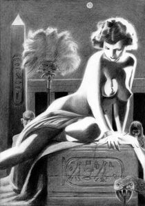
This graphite pencil drawing ‘Cleopatra – 23-02-24’ refers to a work under the same name I made back in 2018. That year I started my ‘Out of Egypt’ series and in retrospective I can see it wasn’t without a reason. Art Deco is on my mind for quite some time now under which flag I can show more. Cubism is very fine and I even forged my own style ‘Roundism’ out of it but I want more. Egyptian art I consider a big and heavy precursor to Art Deco. Obviously the latter was influenced directly after the discovery of Pharaoh Tutankhamun’s tomb. Surely, those Egyptians had style and swag. This drawing I plan to serve as a bridge between great artistic eras divided by oceans of time.

Hollywood

The reference picture was from the 1920s I believe and shows hefty quantities of light and dark. Also called ‘chiaroscuro’ the phenomenon could be characterized by abrupt shifts in tonal values. Through these a certain dramatic effect is created; meat for the beast I’d say! Next, why Cleopatra? Something occured to me, Lawrence Alma Tadema’s paintings of the ancient world served as an inspirational source for Hollywood. Without his artworks movies like Ben Hur, The Ten Commandments by Cecil B. DeMille and Gladiator wouldn’t have been created.

Back to Egypt

At the start of the drawing I planned for some pareidolia effects. Then I saw the head of the Sphinx in her groin. However, I decided not to follow that trail. It was only very faint and proportions weren’t that ideal. The rugged carpet the model is leaning on wasn’t inspirational either. All of a sudden the drawing of 2018 popped into my head. From there it wasn’t difficult to create a small Egyptian world around her, inclusive a viper. Has she been bitten yet?

Graphite pencil (Faber Castell Pitt Graphite Matt pencil 14B) drawing on Talens Bristol paper (21 x 29.7 x 0.1 cm)
Artist: Corné Akkers

My Compliments

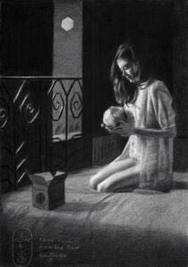
This graphite pencil drawing ‘Third Rock from the Sun – 15-02-24’ I wanted to create for a long time. However, caught up in some projects in oil I had some time to think about the execution. First, let me start with complementing model Nina and her photographer. You probably know her from the series I made last year. If you like you can visit her website. She had a new photoshoot published and I saw one photo that got my attention. What a great lighting and thanks for letting me use it!

Rembrandt’s & Vemeer’s Legacy

Living in The Netherlands it’s imposssible to escape the legacy of Rembrandt and Vermeer. Surely not the inventors of chiaroscuro effects but they took lighting to another level. So no surprise there they are world famous. Consequently I became fascinated by the light too. So much so that I dedicated almost my entire work to it. So there it was, a great model, great lighting and now a theme. Deviating from the picture I felt was necessary. It always does because sheer copying isn’t my bag. This was the first time after ‘Neo Deco 18-10-23’ I used bristol paper again. I had it in me to combine that to the slightly angular approach I used in ‘Nina – 12-09-23’. This way I could use all the fantastically highlighed elements without the necessity to invent nifty cubist forms.

The Whole World in Your Hands

As always, whilst drawing I came up with an idea. Instead of the motorized house buddy she was holding in her hands I thought of mother earth. If you have reached this section of my art statement you most certainly care for environmental issues as well. Sometimes you have to listen to the universe. And so it came to be halfway through the drawing I listen to a news item on sea level rise. As artist I can be powerful and highlight that topic for a change. Not the first time though and perhaps you remember ‘Yeast – 18-09-19’. There you have it, the whole world in your hands AKA The Third Rock from the Sun. Threat her carefully!

Graphite pencil (Faber Castell Pitt Graphite Matt pencil 14B) drawing on Talens Bristol paper (21 x 29.7 x 0.1 cm)
Artist: Corné Akkers

Contrasting Colors

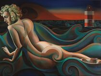
This oil painting ‘The Infinite Waves of Eternity’ might look like something you have seen before. That’s right. It’s an elaboration of my graphite pencil drawing ‘The Infinite Waves of Eternity - 15-06-19 (Sold)’. Now it was time to convert it to color. Again I chose for subtle shades between complementary and therefor contrasting colors red and green. Students I often tell about comparing colours with human relations. These contrasting colors and mixtures of them create a maximal bandwith of relations and therefor emotions. To me it was necessary for what I had to say and that’s a lot.

Kizette

However, it is also an ode to Kizette, daughter of Tamara de Lempicka. The latter, to whom I already declared my eternal artistic love. That much is obvious. So I present you a chain of thoughts I had. The head in aforementioned drawing I wasn’t particularly happy with and I thought I could do a better job. Goldilocks this time perhaps? Ringlets could match the golden ratio curves in the waves and body perfectly. That thought led to Kizette. Googling her I saw pictures of Madonna in her glory days during her ‘Blond Ambition’ tour. Then I realized her hairdo was a perfect match to Tamara’s kid. She adores De Lempicka as well. Hence, the female’s head looks a bit like Madonna’s and the hairdo got more styled cubistically.

Art Statement

As to artistic considerations the drawing necessitated me to think and invent further. In my art statement to ‘Neo Deco - 05-01-24’ I quoted Oscar Wilde on ‘Life imitates art rather than art imitates life’. This statement is stuck in my throat as a hot potato. Somehowe it keeps popping up as a guideline for my own art. All these styling and swirls I made throughout the years must be for a reason, wouldn’t you think? Surely it had to be me picking up the gauntlet. So here’s my statement. In this postmodern world we created everything can be manifested. Consequently no one can make heads or tails of it. Anything goes. T.V. and the internet flood us with a rubble pile of nonsense. Such is also visible contemporary art. Not me, I want to create beauty and show people infinite waves of eternity.

Oil on linen (60 x 80 cm)
Artist: Corné Akkers

What Color Can Do

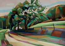
This pastel drawing ‘Berg en Dal – 30-12-23’ is the second of new pastel editions to an ever growing series. The one I completed last December 19th exceeded my expectations. Frankly, I didn’t think I could add more to the reference drawing I made in May. Then you can see what color can do. After my Christmas drawing of December 25th it was time to get back in the saddle again. Nothing else to do either. Outside there is a nasty gloom and I like to avoid fireworks at all costs. This way I still have my eyes and hands on January 1st. Really, it’s a travesty indeed. People buy for 100 million+ euro here in the Netherlands. Foreigners often are surprized when they come to visit us. They say it looks like a war zone at 12 o’clock. Poor Ukrainian refugees. Those millions were better spent in the Ukraine!

Driving Force

Couldn’t this one major driving force: to create art and offer people perspective on beauty? By all means, my pastel chalks are way less expensive than a regular portion of fireworks. Another advantage: my colors don’t fade away instantly. Flares of color in the sky do. With this pastel I also want to convey another idea. Beauty isn’t about spectacular pops that rip open your eardrums but in silence. Hence my latest creation that speaks for itself. A wandering beauty silently expressing captivating colors. New Year’s resolution that now occurs to me: spend more time in nature.

A Blank Spot

The reference drawing I used for this one I completed on November 2nd. Even though that one was impressionist rather than cubist I decided to turn another way this time. Lately I feel I also have to delve into the process of abstracting landscapes in pastel and oil. Somewhat of a blank spot in my oevre. I always have considered my pastels more suited to create impressionism than cubism. Maybe that has got something to do with a specific aspect. Broken hatched strokes create these impressionistic views better than other mediums. On the other hand I always feel myself much of a cheat doing big planes with chalks. That’s easy and perhaps I fear of delivering sloppy and hasty work. Cancel fear for 2024 I’d say and try it anyway. This pastel of this beautiful scenery in Berg en Dal is a first start.

Pastel drawing on Clairfontaine Pastel Mat paper (69.4 x 49.8 x 0.1 cm)
Artist: Corné Akkers

Newest Addition

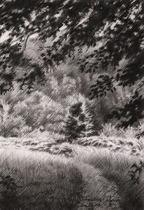
This graphite pencil drawing ‘Duivelsberg – 25-12-23’ is my newest addition to my ever growing Berg en Dal Series. Last pastel was great to do and I am inspired enough to expand the series with new ones. The scenery has everything a landscape artist could wish for. Even little creeks with wonderful water reflections run through it. I’m very much an advocate of this region. I often dwell here except for today. Which is Christmas by the way. It’s gloomy outside so I’d stick to an earlier reference photo I used for this one.
Drawing During Christmas

Last works consist of two pastels and an oil painting. ‘Sinterklaas in Voorburg – 03-12-23’ was my last graphite pencil drawing. That’s due to my intention to take up my pastel chalks once again. Sometimes you simply forget about a certain medium. With one in progress I feel confident to do a little sidestep in graphite again. Besides that, I’m with my parents now and t.v. shows don’t attrack me that much. What can an artist during such a holiday than to sip on an Irisch coffee and simply draw?
To the East

Last artworks handling this area were situated in the west. I thought it was about time to do a sketch of the Duivelsberg to the east of Berg en Dal. You might remember the scene. ‘Beek – 21-07-19’ is made live on just about the same location as this one. The dominant tree in the middle of the drawing is the same anyway. There is this path that leads to the Filosofendal. From that I took a picture in the direction of this very tree.
Artistic Approach

As to my artistic approach there was a nice distribution of tonal values I could work with. In the front there were many nice dark tonal regions. These are the leafy structures in the upper part of corner and the lower part formed by the path. The aim was to make this one not cubist as the previous but impressionist. These decisions came on a whim really. I think I fell in love with the smashing chiaroscuro depiction. The tonal distribution in the picture lends itself to impressionism more than to abstract forms cubistically. I’m glad I can handle, together with surrealism, all these styles. I hope I put a distinct mark on all these three and people will be able to acknowledge that.

Graphite pencil drawing (Faber Castell, Pitt Graphite matt, 14B) on Winsor & Newton Bristol board paper (21 x 14.8 x 0.1 cm – A5 format)

Artist: Corné Akkers

Another Go in Pastel

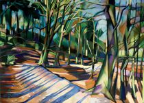
This pastel drawing ‘Berg en Dal – 19-12-23’ is an elaboration of a graphite pencil drawing from May this year. After Golden 13-12-23 I wanted to do something different. Maybe altogether doing landscapes in pastel is on my mind again for quite a while now. My Series under the same name I sold out long ago. They are scattered over the whole word: China, America and Europe. Perhaps you remember Dali and Picasso, two great artists who were commercial talents as well. It’s obvious I love Berg en Dal so much and all pastels have been sold. Why combine these two facts and have another go?

Cubism

Back in 2014 when I made these pastels I was only discovering and forging my cubist style into roundism. That is, with regard to the female form. Later I started to apply cubism to cityscapes and landscapes as well. An example is the Schiedam Series. Well, preliminary work has been done already in this particular case. I liked the concept that much I decided this to be the kick-off for additions to the series.

Approach

Setting out proportions and forms was easy. Colors aren’t, obviously due to their relative character. That is why I decided for a save bet: pink and purples, orange, blue and green. So two cool and two profound warm colors. The trick is to not explode into colour saturation too much right away. Softening those later is quite a drag. Soft pastels like Schmincke simply don’t allow much of a second coat on top of a first. So, walking on the brink for me. Got that right, then I found some colored patches in the background too protruding. Contour delineations were to harsh. I soften them by rubbed them together. Finally I topped it off by enforcing some linear structures in the trees in the front. Surely I don’t think I can improve it now so I stopped.

Pastel drawing on Clairfontaine Pastel Mat paper (69.4 x 49.8 x 0.1 cm)
Artist: Corné Akkers

Return to the Female Form

This graphite pencil drawing ‘Neo Deco – 03-08-23’ is a return to the female form. After a couple of celebrity portraits I felt it was time to do a nude again. The fact that I received a wonderful picture from a follower of my artworks online also helped. It depicts his wife. Their dream was to be portrayed in a way similar to the one I did back in June. As a matter of principle, I have nothing against women who volunteer to be drawn by me. Therefore, the decision to move ahead was easy.
Sui Generis

Not that I commence right away. The model has to be a good one. Not everybody can strike a pose I like and the opposite naturally is true. Not everybody likes my style or approach. That’s why the relationship between model and artist is ‘sui generis’, a world on its own. The match has to be perfect. In fact, in this particular case that was true. Even though I didn’t see her in the flesh. The reason was the reference photo was a good one. She is standing in front of a window. I must say, the sheer curtains matched the hefty tonal play on her body perfectly.
Sheerness

The scenery reminded me to my drawing ‘Sheer Deco Nude – 14-10-22’ of last year. After my love for shiny satin I celebrated sheer fabrics engirding bodyshapes in that one. In both drawings a darker body seems sandwiched between two sides of fluffy light structures. Basically, this time I wanted to combine the principles of round and straight structures with sheer fabrics. See what that would bring me.
Let It Breathe

After capturing proportions I set out to darken body structures. However, I soon realized doing too much would make it appear to become lumpy again. It’s something I try to avoid of late more often. The lower leg for example I left open so it could breathe straight into the negative space. It’s similar to what I did in Veronica Lake’s drawing. Hence contrasts between curtains and body are preserved but they also flow into eachother. It almost has an impressionist feel to it.

Graphite pencil (Faber Castell Pitt Graphite Matt pencil 14B) drawing on Fabriano Ingres paper (21 x 29.7 x 0.1 cm)

Artist: Corné Akkers

Slender Body

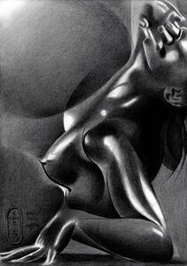
This graphite pencil drawing ‘Nina – 16-08-23’ is the second I made of this beautiful model. Her portrait I drew a week ago and I fancied doing another one. Her slender body offers me a new perspective on artistic forms I can draw from the female form. For those who missed out on her links: visit her website or profile on deviantart.com: ‘NinaErotique’. It’s like every model has her signature pattern designs. Obviously, that makes every woman unique. Both straight and round forms combined I saw this time. Next to these I depicted her on a glass table in the nude. I’d say, enough challenges to face and find solutions for.
Tonal Troubles

Unlike ‘Neo Deco – 02-08-23’ and my last oil ‘Neo Deco – 10-08-23’ there weren’t many tonal differences to hold on to. This has got nothing to do with her fair skin tone. That’s because even people with pale ones can show a full array of values. It was all about the subdued lighting in the scenery. That’s where I knew I had to come up with a dramatic solution in the form of ‘solarization’ once more. Frankly, I was also curious how my solarized concepts would look like on Ingres paper. Hitherto I made them on Bristol paper only due to smooth transitional possibilities.
Powerlines

Soon I found out I had to rub a lot of planes out with a stumper. Otherwise they would have looked too crumbly. That’s what Ingres paper allows and can do. Primarily it’s suitable for impressionist themes, I think. But hey, I never back down from a challenge. I came up with the solution to enforce linear structures and made them thicker and darker. Some might call them ‘power lines’. They strengthen the overall composition I think. They offer structure and thus guide the viewer through the artwork. I made sure I also let her body flow into the negative space as well. Otherwise the positive form of the body would have appeared too separated from the negative space. Not her hair though! I erased the light paper back around it and by that a sort of halo emerged, enhancing her angelic face.
Metallic Look

All in all, the result is a kind of metallic look. It reminds me to ‘A Metallurgical Approach to Bettie Page – 12-03-17’. Solarisation also creates lovely new forms. Hence, this style is also associated with surrealism. In particular I like the snake-like light patterns on her limbs.
Nipple-Policy

Last but not least, I skipped a lot of details in the background. There was this painting with a couple of abstracts forms. Incorporating them would have been too much of a good thing. Instead I placed my monogram and title there. Glass table reflections in the low part of the drawing prevented me from placing them there anyway. What I didn’t leave out were her nipples. I proclaim: they serve as beacons of sexual liberty. Not even sexuality for sure. They also represent true aesthetic beauty. Let everybody rejecting (artistic) nudity think twice before picking on them online. Do you think carrying a gun or playing violent video games is a cute thing? That’s why you only like safe paintings of dogs, horses and cats? I’m looking forward to the first hateful comments though. That makes me an artist on a mission with a wink. Blink or honk if you agree.

Graphite pencil (Faber Castell Pitt Graphite Matt pencil 14B) drawing on Fabriano Ingres paper (21 x 29.7 x 0.1 cm)

Artist: Corné Akkers

Return to the Female Form

This graphite pencil drawing ‘Neo Deco – 03-08-23’ is a return to the female form. After a couple of celebrity portraits I felt it was time to do a nude again. The fact that I received a wonderful picture from a follower of my artworks online also helped. It depicts his wife. Their dream was to be portrayed in a way similar to the one I did back in June. As a matter of principle, I have nothing against women who volunteer to be drawn by me. Therefore, the decision to move ahead was easy.

Sui Generis

Not that I commence right away. The model has to be a good one. Not everybody can strike a pose I like and the opposite naturally is true. Not everybody likes my style or approach. That’s why the relationship between model and artist is ‘sui generis’, a world on its own. The match has to be perfect. In fact, in this particular case that was true. Even though I didn’t see her in the flesh. The reason was the reference photo was a good one. She is standing in front of a window. I must say, the sheer curtains matched the hefty tonal play on her body perfectly.

Sheerness

The scenery reminded me to my drawing ‘Sheer Deco Nude – 14-10-22’ of last year. After my love for shiny satin I celebrated sheer fabrics engirding bodyshapes in that one. In both drawings a darker body seems sandwiched between two sides of fluffy light structures. Basically, this time I wanted to combine the principles of round and straight structures with sheer fabrics. See what that would bring me.

Let It Breathe

After capturing proportions I set out to darken body structures. However, I soon realized doing too much would make it appear to become lumpy again. It’s something I try to avoid of late more often. The lower leg for example I left open so it could breathe straight into the negative space. It’s similar to what I did in Veronica Lake’s drawing. Hence contrasts between curtains and body are preserved but they also flow into eachother. It almost has an impressionist feel to it.

Graphite pencil (Faber Castell Pitt Graphite Matt pencil 14B) drawing on Fabriano Ingres paper (21 x 29.7 x 0.1 cm)
Artist: Corné Akkers

You need help?
Whatsapp